I have the following code for my Hugo page for listing out new posts, formatted with Tailwind CSS:
{{ define "main" }}
{{ range .Pages }}
<div class="grid grid-flow-row grid-cols-3">
    <div class="flex justify-center">
            <div class="bg-white shadow-xl rounded-lg overflow-hidden">
                <div class="bg-cover bg-center h-56 p-4" style="background-image: url(https://ui-avatars.com/api/?name=John+Doe&size=512)">
                    <div class="flex justify-end">

                    </div>
                </div>
                <div class="p-4">
                    <p class="uppercase tracking-wide text-sm font-bold text-gray-700">{{ .Params.Major}}</p>
                    <p class="text-3xl text-gray-900 font-bold">{{ .Title }}</p>
                    <p class="text-gray-700">A small description and a bucnch of stuff.</p>
                </div>
                <div class="flex p-4 border-t border-gray-300 text-gray-700">
                    <div class="flex-1 inline-flex items-center">
                        <svg class="h-6 w-6 text-gray-600 fill-current mr-3" viewBox="0 0 20 20">
                        <path d="M15.573,11.624c0.568-0.478,0.947-1.219,0.947-2.019c0-1.37-1.108-2.569-2.371-2.569s-2.371,1.2-2.371,2.569c0,0.8,0.379,1.542,0.946,2.019c-0.253,0.089-0.496,0.2-0.728,0.332c-0.743-0.898-1.745-1.573-2.891-1.911c0.877-0.61,1.486-1.666,1.486-2.812c0-1.79-1.479-3.359-3.162-3.359S4.269,5.443,4.269,7.233c0,1.146,0.608,2.202,1.486,2.812c-2.454,0.725-4.252,2.998-4.252,5.685c0,0.218,0.178,0.396,0.395,0.396h16.203c0.218,0,0.396-0.178,0.396-0.396C18.497,13.831,17.273,12.216,15.573,11.624 M12.568,9.605c0-0.822,0.689-1.779,1.581-1.779s1.58,0.957,1.58,1.779s-0.688,1.779-1.58,1.779S12.568,10.427,12.568,9.605 M5.06,7.233c0-1.213,1.014-2.569,2.371-2.569c1.358,0,2.371,1.355,2.371,2.569S8.789,9.802,7.431,9.802C6.073,9.802,5.06,8.447,5.06,7.233 M2.309,15.335c0.202-2.649,2.423-4.742,5.122-4.742s4.921,2.093,5.122,4.742H2.309z M13.346,15.335c-0.067-0.997-0.382-1.928-0.882-2.732c0.502-0.271,1.075-0.429,1.686-0.429c1.828,0,3.338,1.385,3.535,3.161H13.346z"></path>
                    </svg>
                        <p><span class="text-gray-900 font-bold">3rd</span> Year</p>
                    </div>
                    <div class="flex-1 inline-flex items-center">
                        <svg class="h-6 w-6 text-gray-600 fill-current mr-3" xmlns="http://www.w3.org/2000/svg" viewBox="0 0 24 24">
                            <path fill-rule="evenodd" d="M17.03 21H7.97a4 4 0 0 1-1.3-.22l-1.22 2.44-.9-.44 1.22-2.44a4 4 0 0 1-1.38-1.55L.5 11h7.56a4 4 0 0 1 1.78.42l2.32 1.16a4 4 0 0 0 1.78.42h9.56l-2.9 5.79a4 4 0 0 1-1.37 1.55l1.22 2.44-.9.44-1.22-2.44a4 4 0 0 1-1.3.22zM21 11h2.5a.5.5 0 1 1 0 1h-9.06a4.5 4.5 0 0 1-2-.48l-2.32-1.15A3.5 3.5 0 0 0 8.56 10H.5a.5.5 0 0 1 0-1h8.06c.7 0 1.38.16 2 .48l2.32 1.15a3.5 3.5 0 0 0 1.56.37H20V2a1 1 0 0 0-1.74-.67c.64.97.53 2.29-.32 3.14l-.35.36-3.54-3.54.35-.35a2.5 2.5 0 0 1 3.15-.32A2 2 0 0 1 21 2v9zm-5.48-9.65l2 2a1.5 1.5 0 0 0-2-2zm-10.23 17A3 3 0 0 0 7.97 20h9.06a3 3 0 0 0 2.68-1.66L21.88 14h-7.94a5 5 0 0 1-2.23-.53L9.4 12.32A3 3 0 0 0 8.06 12H2.12l3.17 6.34z"></path>
                        </svg>
                        <p><span class="text-gray-900 font-bold"></span> Programming</p>
                    </div>
                </div>
                <div class="px-4 pt-3 pb-4 border-t border-gray-300 bg-gray-100">
                    <div class="text-xs uppercase font-bold text-gray-600 tracking-wide">Made By</div>
                    <div class="flex items-center pt-2">

                        <div>
                            <p class="font-bold text-gray-900">Aman Bhargava</p>

                        </div>
                    </div>
                </div>
            </div>
        </div>
</div>
{{ end }}
{{ end }}
What I want is to have three columns of cards, with each new post being added left to right in the columns before adding a new row below. However, my code gives me a stacked listing instead of the expected output:
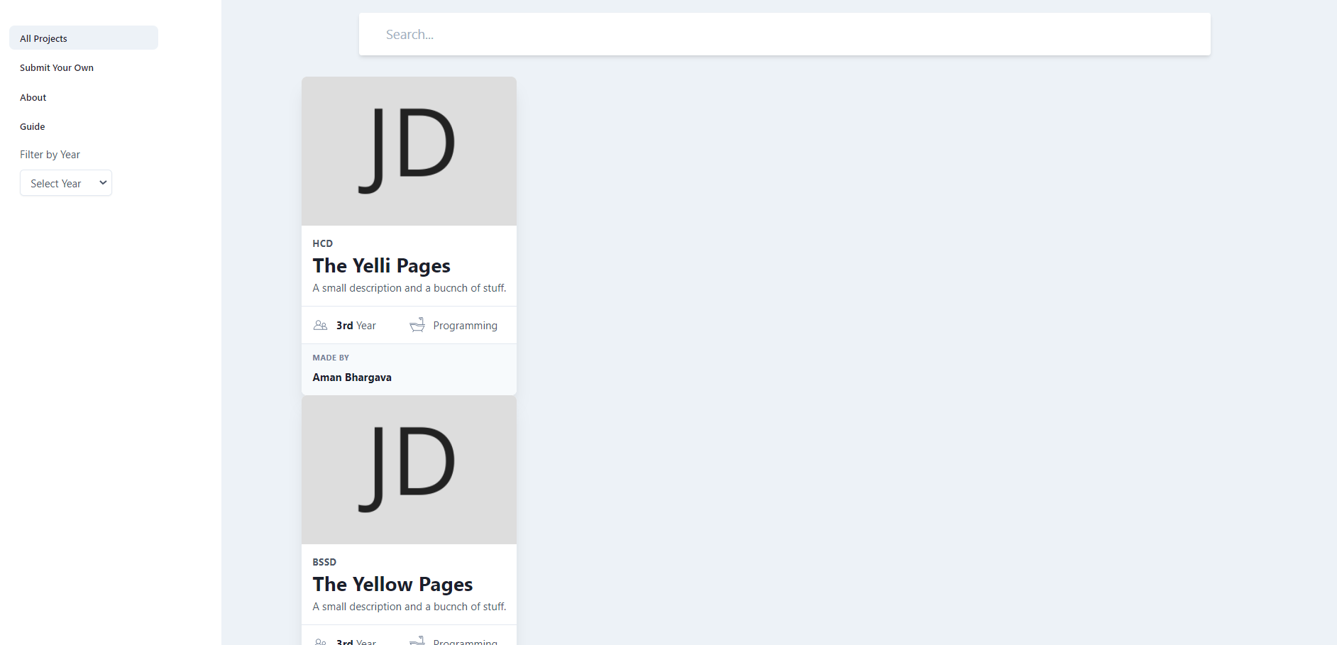
I would like something like this:
| 1st Column |
2nd Column |
3rd Column |
| First Post |
Second Post |
Third Post |
| Fourth Post |
Fifth Post |
Sixth Post |